LifePlus
Role: Freelance Designer for DiGo
Services:
Identity System
Brand Book
Packaging Design
Website Re-skin
Client Overview:
Lifeplus is a nutritional/supplement company that covers an extraordinary range of product-types, from standard daily vitamins to performance protein powders to skincare products. All products are made up of the most high quality ingredients in the supplementary/nutritional space and are tested to ensure naturopathic/wellness benefits.
The Challenge
Lifeplus has lost control of the brand to the thousands of business-builders who sell products and drive growth. This has led to “brand anarchy” - a lack of focus and consistency in how the brand comes to market. Lifeplus also has a hard time making customers “stick.”
The Solution
Create a brand identity that can inspire trust with all customers and associates. This will be pulled through all touch points to make experiences more consistent— from packaging to communications. The identity must capture & telegraph the energy and spirit of Lifeplus.
Logo Design

Rationale
The Lifeplus icon is made using the two L’s to create a helix. The helix is used to represent the science and nature that is at the core of the Lifeplus brand. Wellness is in our DNA. The logo uses a modern, geometric sans-serif type with varying x-heights to create energy and liveliness that is contained nicely within a rectangle shape. The colors in the helix mark are elemental and inspired by nature.
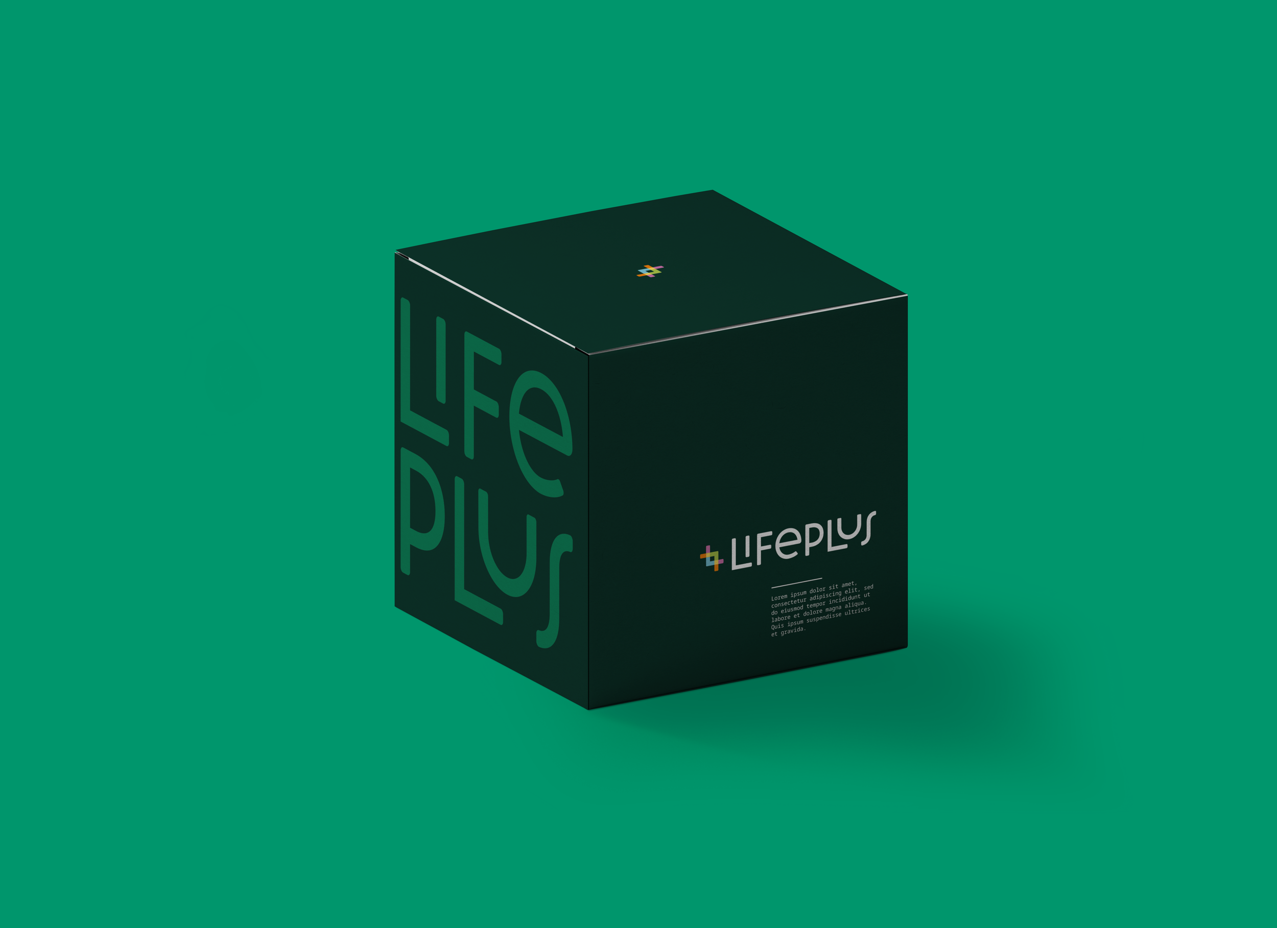
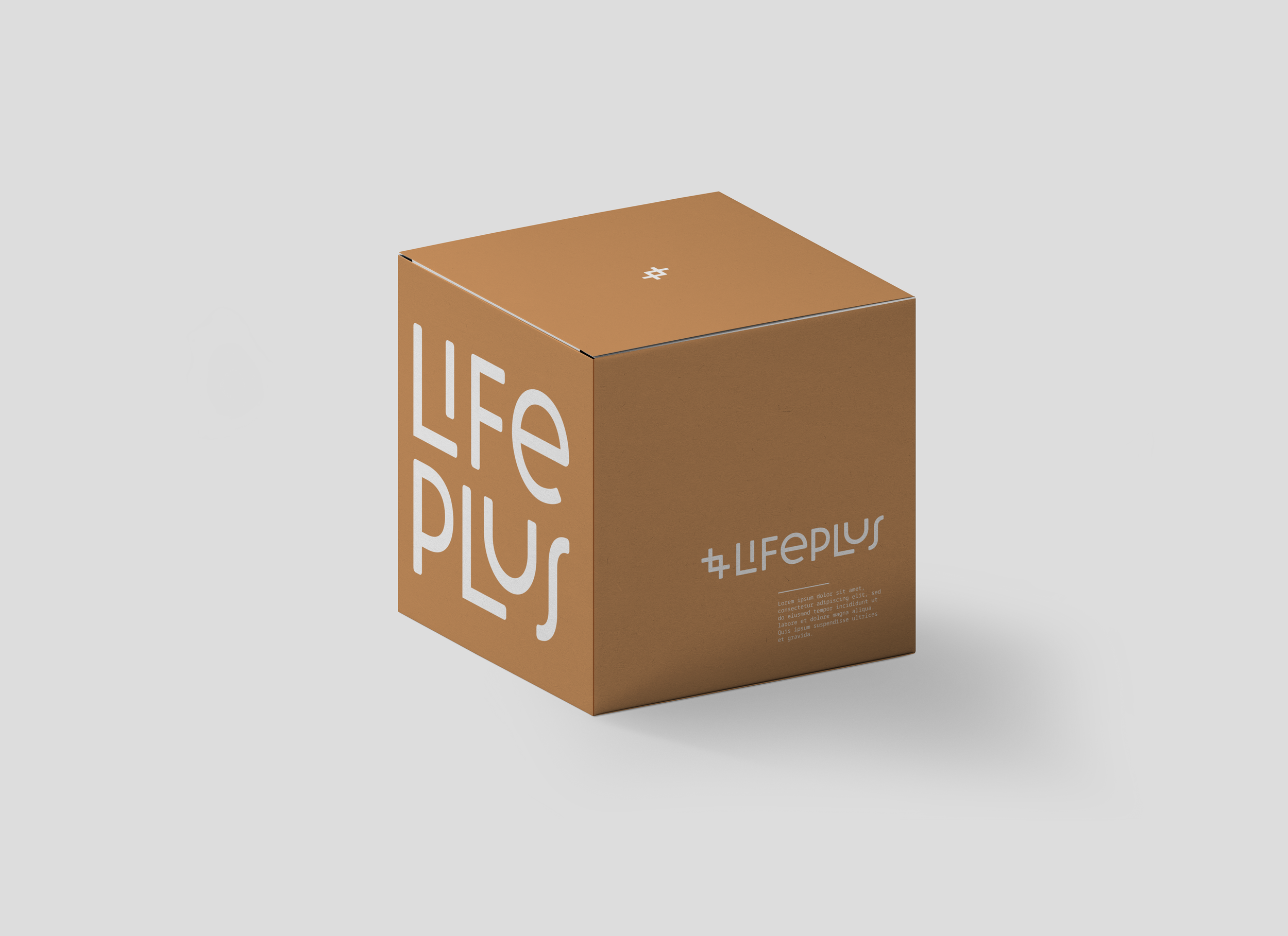
Packaging Design


WEBSITE RESKIN
These website reskin designs were created for the purpose of a directional guide for how to visually execute the brand identity across the web platform.


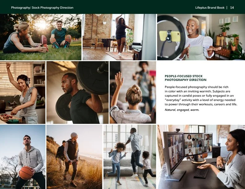
Brand Book

The LifePlus brand book contains rules and guides on how to properly execute the brand moving forward—whether internally or using external partners and vendors. Stock photography direction can be seen below as an example.