Two Roads Brewing: Typecast Can Design
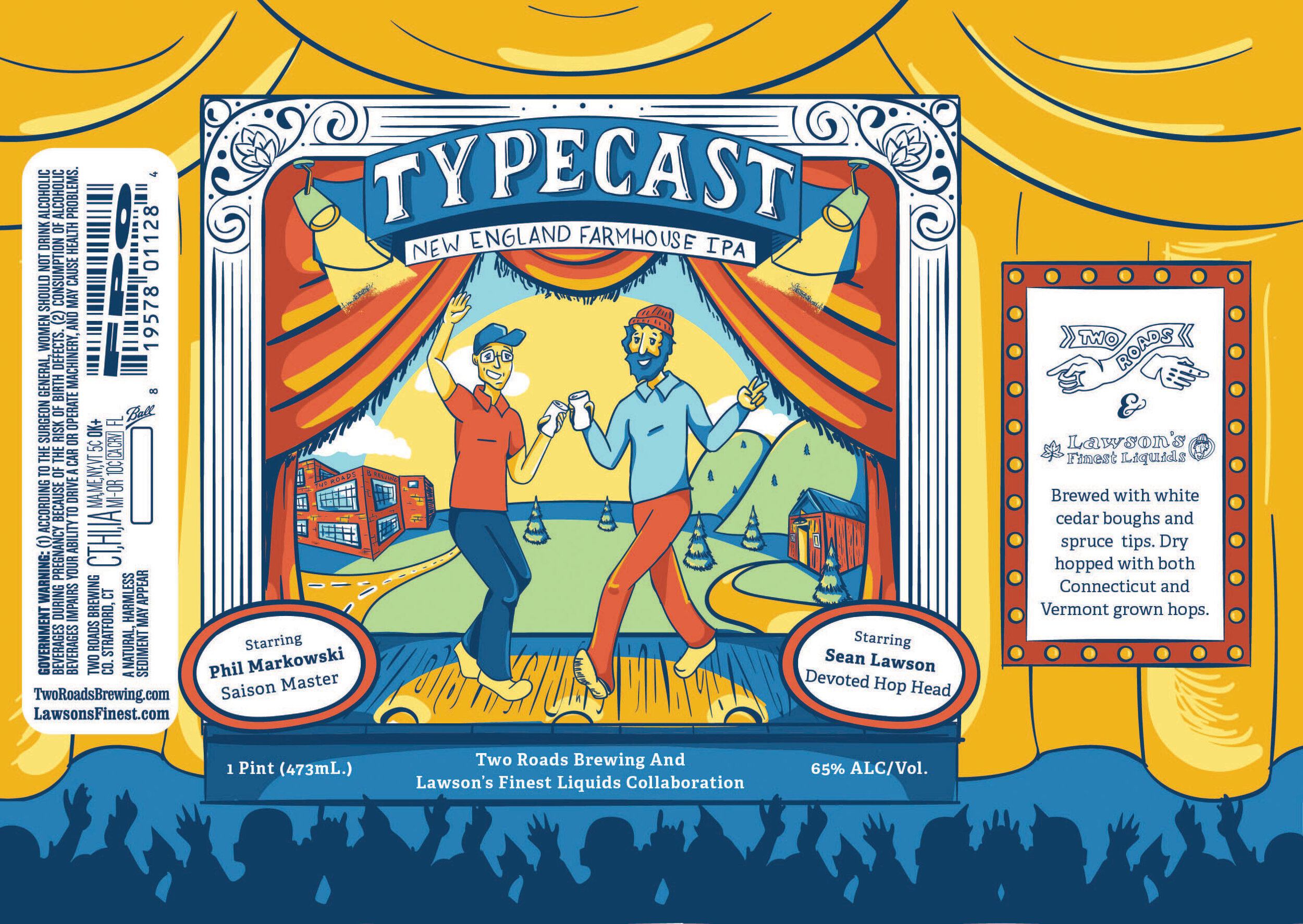
This is a can design for a collaborative effort between Two Roads Brewing (Stratford, CT) and Lawson’s Finest Liquids (Hidden in the backwoods of Vermont).
This name is a playful take on Phil and Sean’s respective “beer style stereotypes.” Phil is obviously known as the foremost leader and brewer of Farmhouse Ales and Sean’s IPAs are world famous. It only made sense that the two brewers combine their “typecast” styles into a Farmhouse IPA—a true collaboration and partnership.
The Challenge
As a collaboration project, we needed to combine the two brands and identities into one cohesive design while respectively representing them individually.
The Solution
I illustrated both the brewers and their locations in a similar styles where they take their place on stage to play their “typecasted” roles.
Services:
Illustration
Packaging Design
“Typecast” is a term associated with the arts, especially when an actor is casted as the same role time and again. TYPECAST is highlighting Sean and Phil’s praised performances, but also taking the stage as something new created together.
Character and color exploration.
Character and color exploration.
Concept Exploration
These concepts were ultimately not chosen, but we still love them!
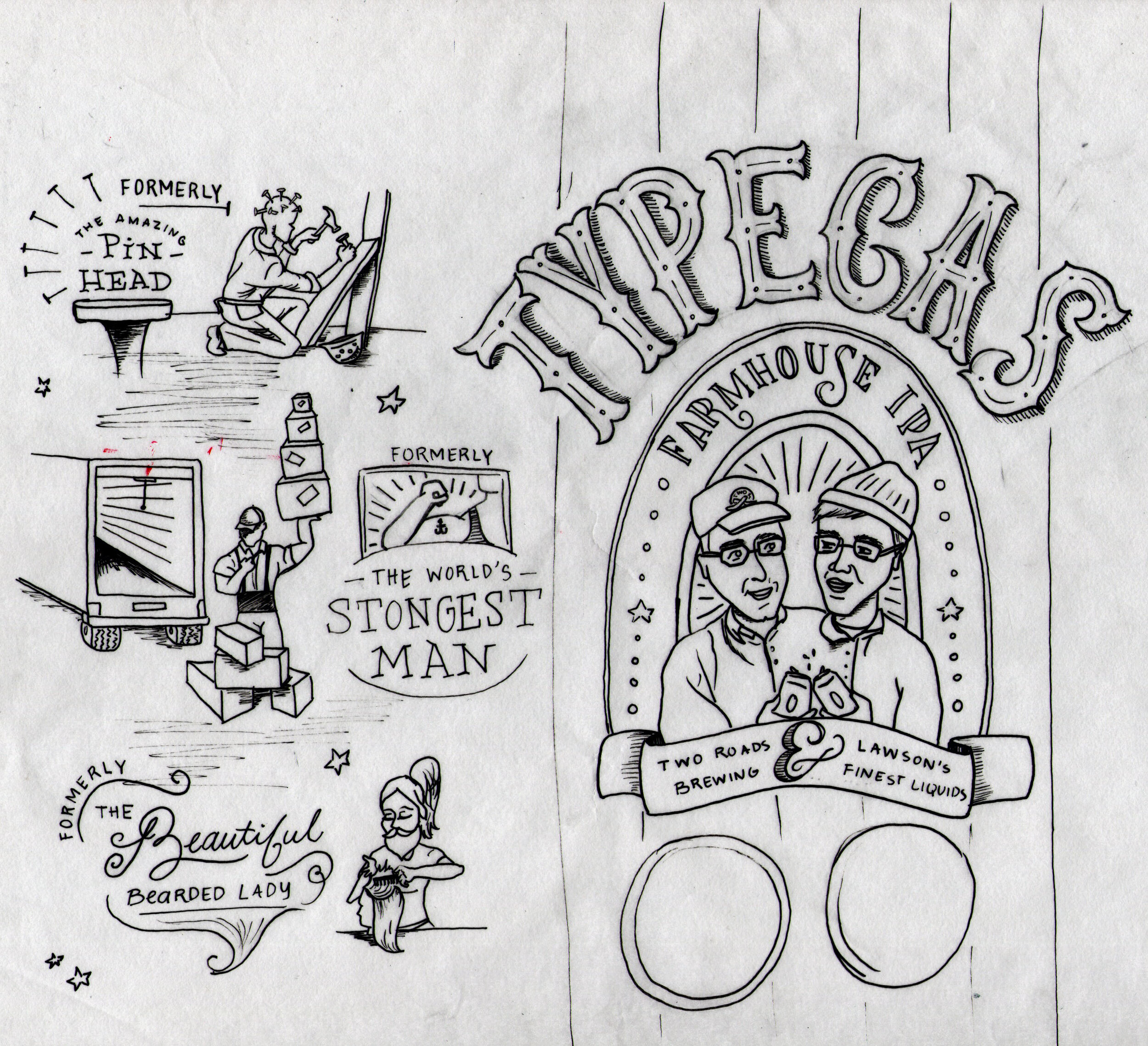
This concept focuses on typecast’s definition in a playful and narrative way. This concept depicts performers who have broken out of their uniquely typecasted roles and are living their most “normal” life.
The Bearded Lady is shown in her new life as a beauty-school student, The Worlds Strongest Man is shown working as a delivery man, and Pin Head is now using his talents for a construction job.
Phil and Sean are illustrated as a pair of conjoined twins who have put their heads together to make the best collaborative brew.
The creative brief gave freedom to play with spelling and letter arrangement, as well as presented the challenge of working in “IPA.”
This concept answers that challenge by focusing on the double entendre of the TIPECAST (typecast) title and IPA. A sporadic juxtaposition of the letters as well as a highlight on the flavors, such as spruce tips and white cedar boughs, inspired a “crafted-like” aesthetic.


