FitCore Logo
Overview
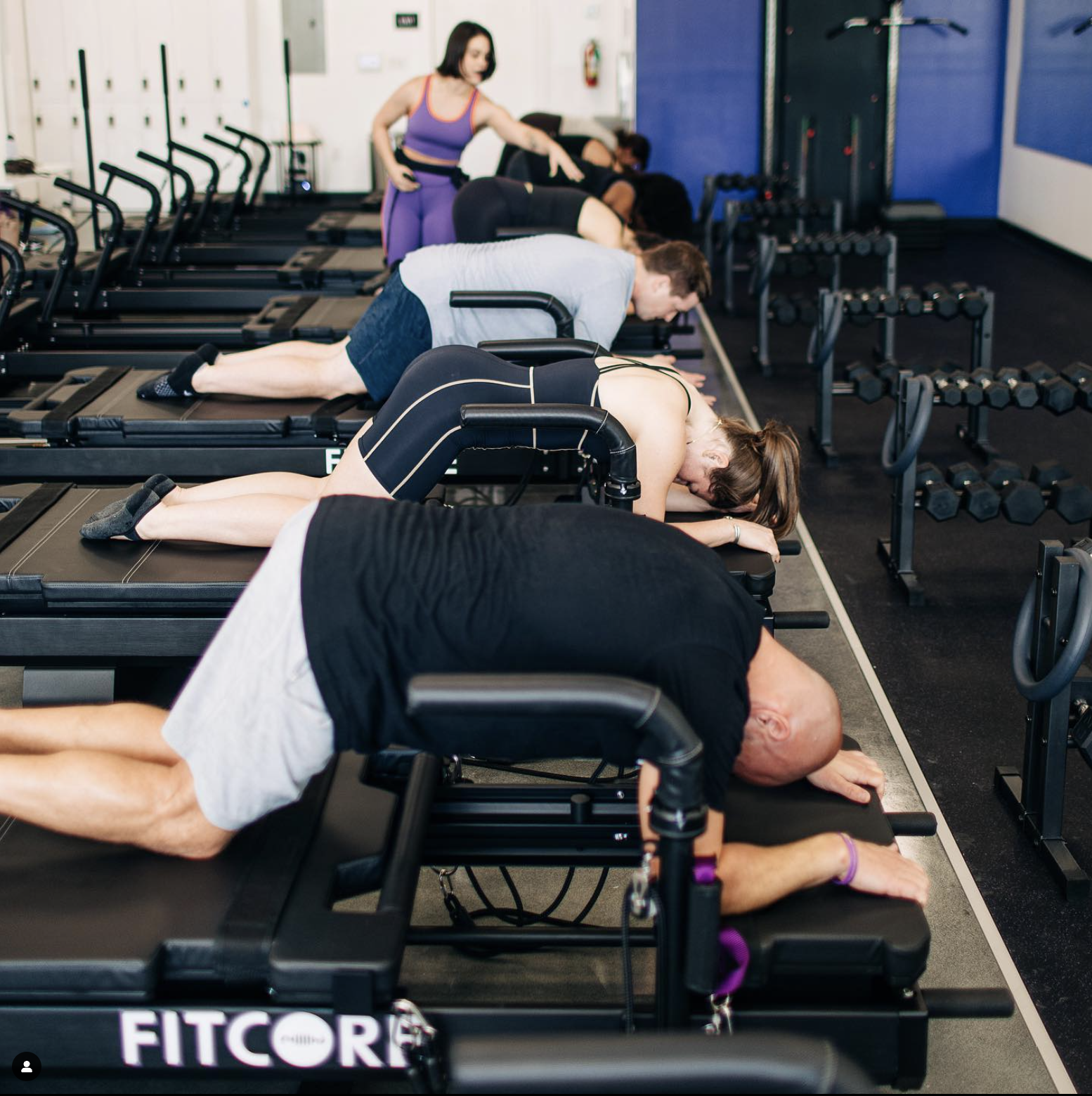
At FitCore we place a strong emphasis on quality and form. Our focus is on stability and strength, with every move having an emphasis on core control. Building your core creates a strong foundation that will not only help your workout goals, but also provide sustainable and long-term benefits for functional health and wellness. Our core belief is quality over quantity—intentional, effective movements in a safe environment. We want you to understand the exercises—why you are doing them and how to do them properly.
The Challenge
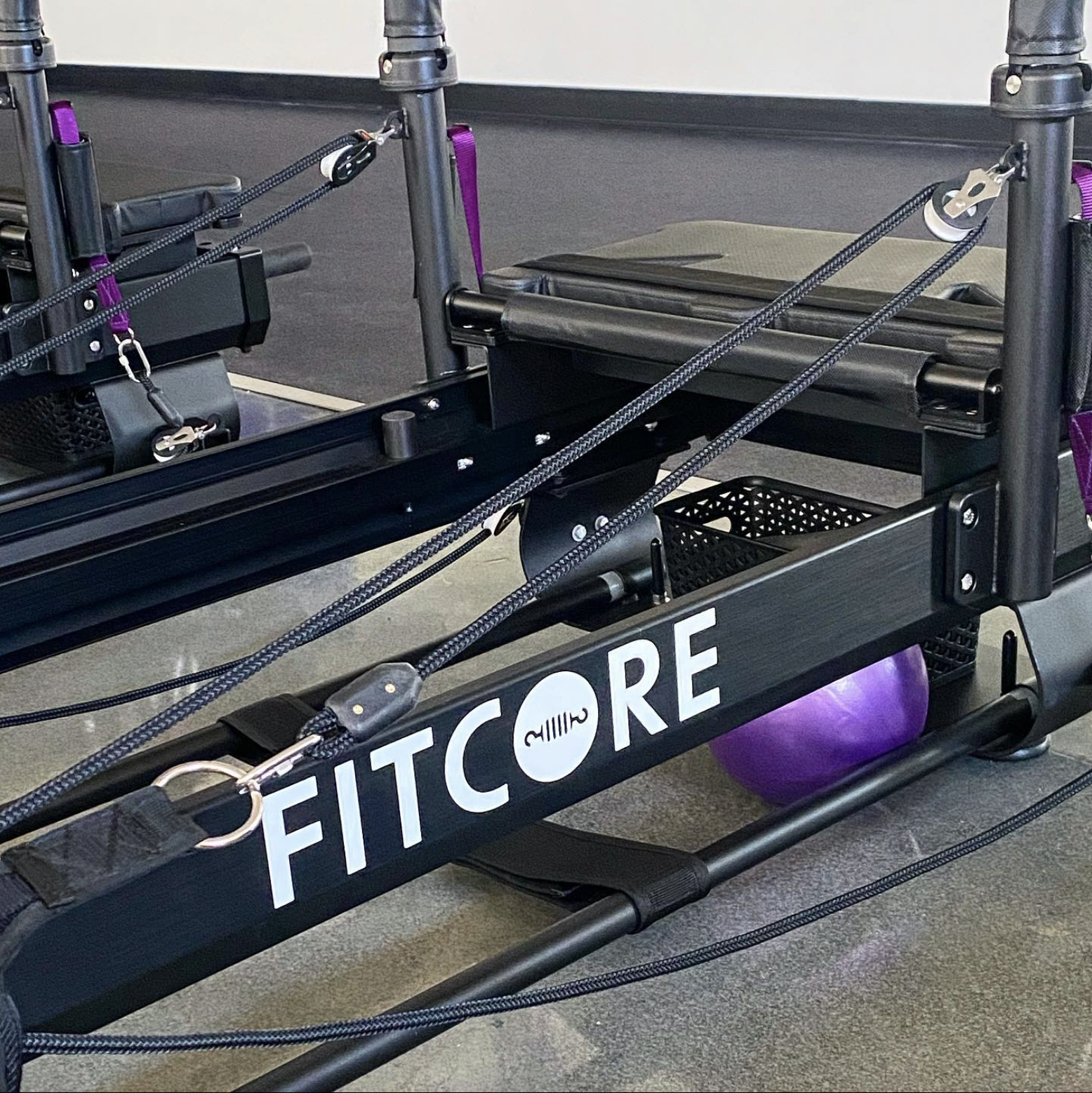
FitCore is a high intensity workout studio with a focus on Xformers (modernized pilates machine). As a new service and a new studio, we were tasked with the job to keep the branding welcoming for both female and male audiences, play to key audience location of Baton Rouge and communicate with the niche Xformer pilates market.
The Solution
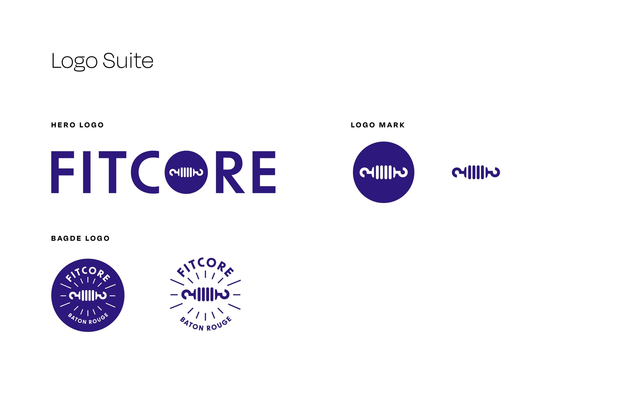
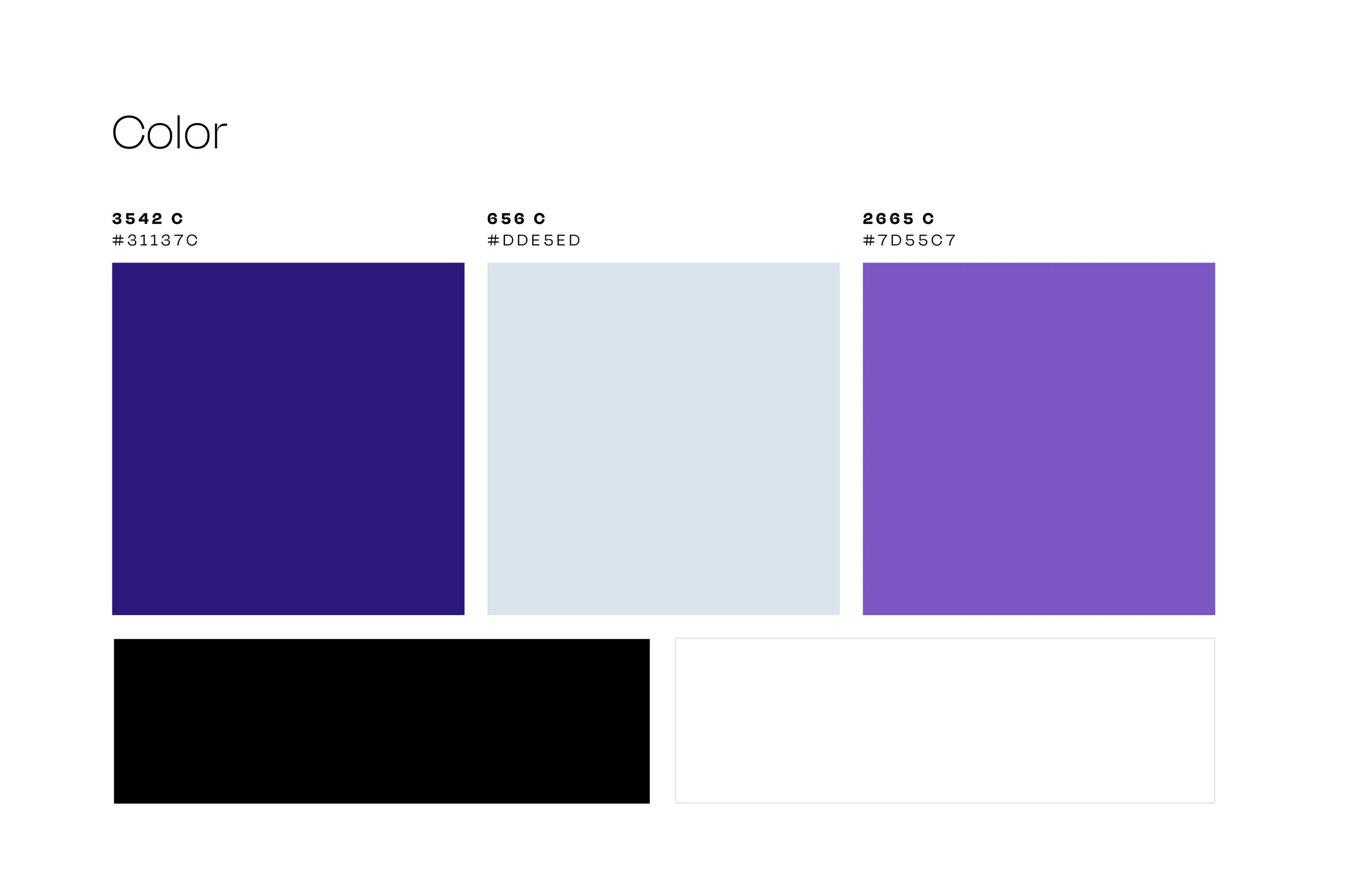
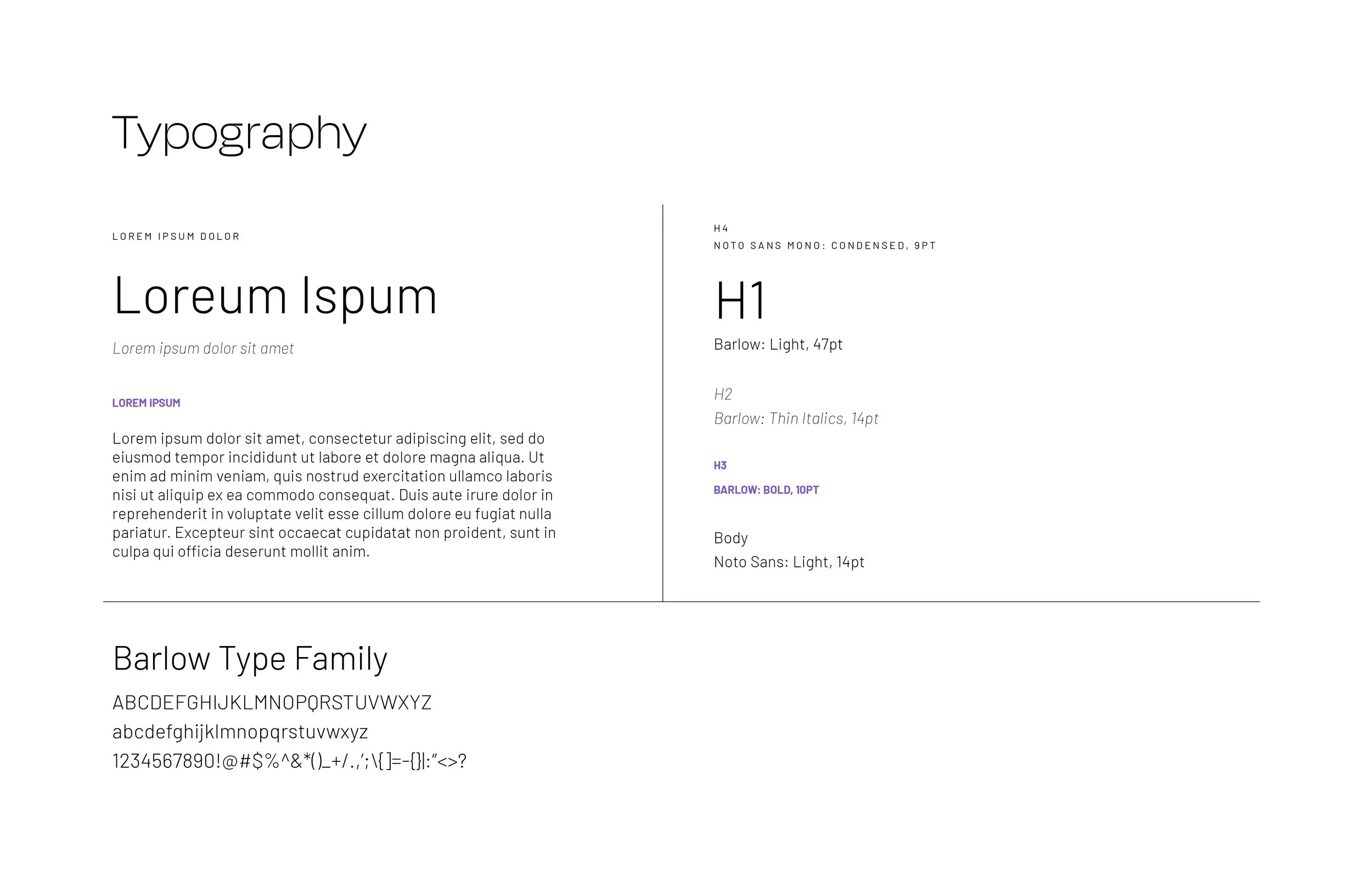
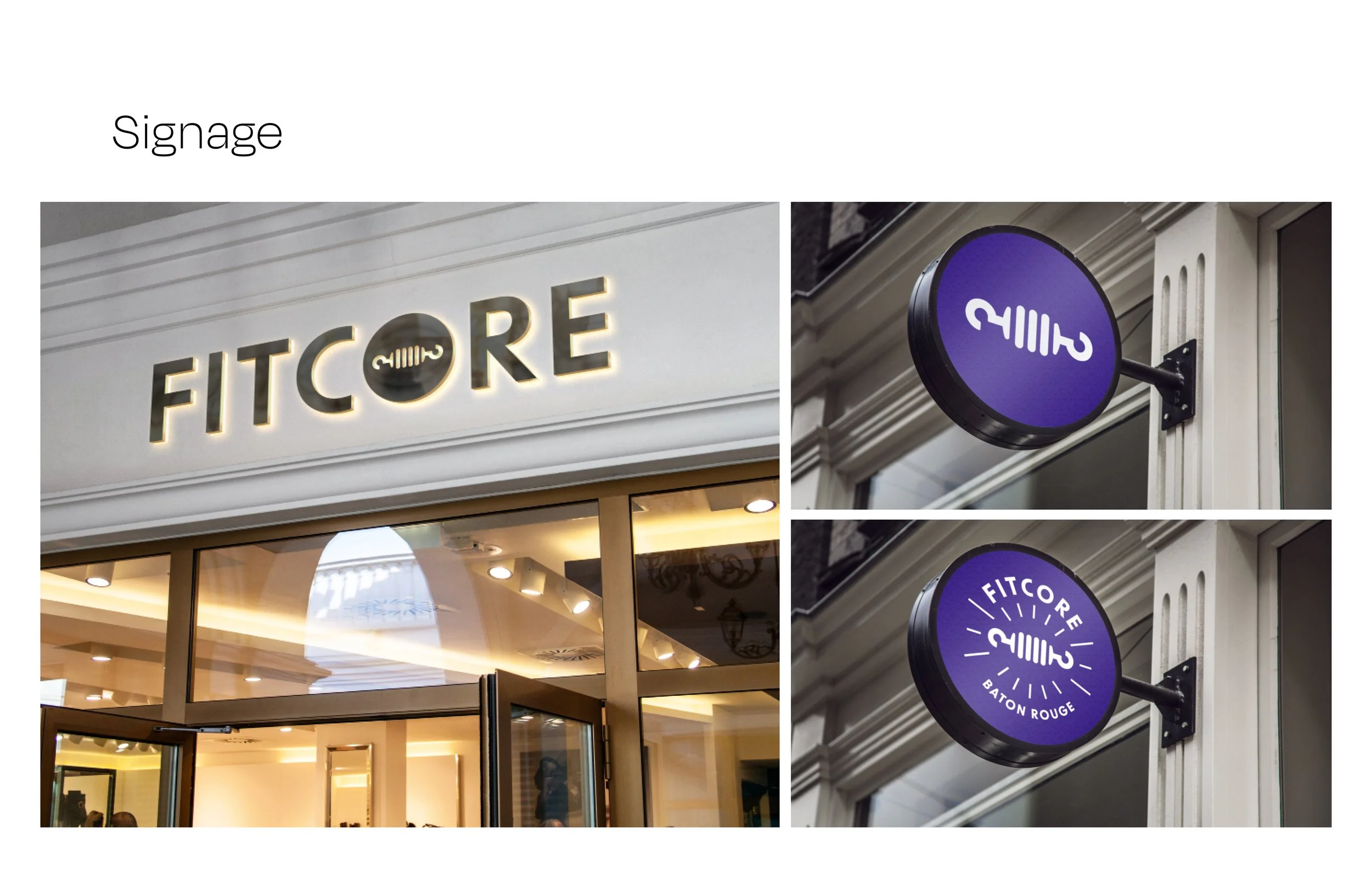
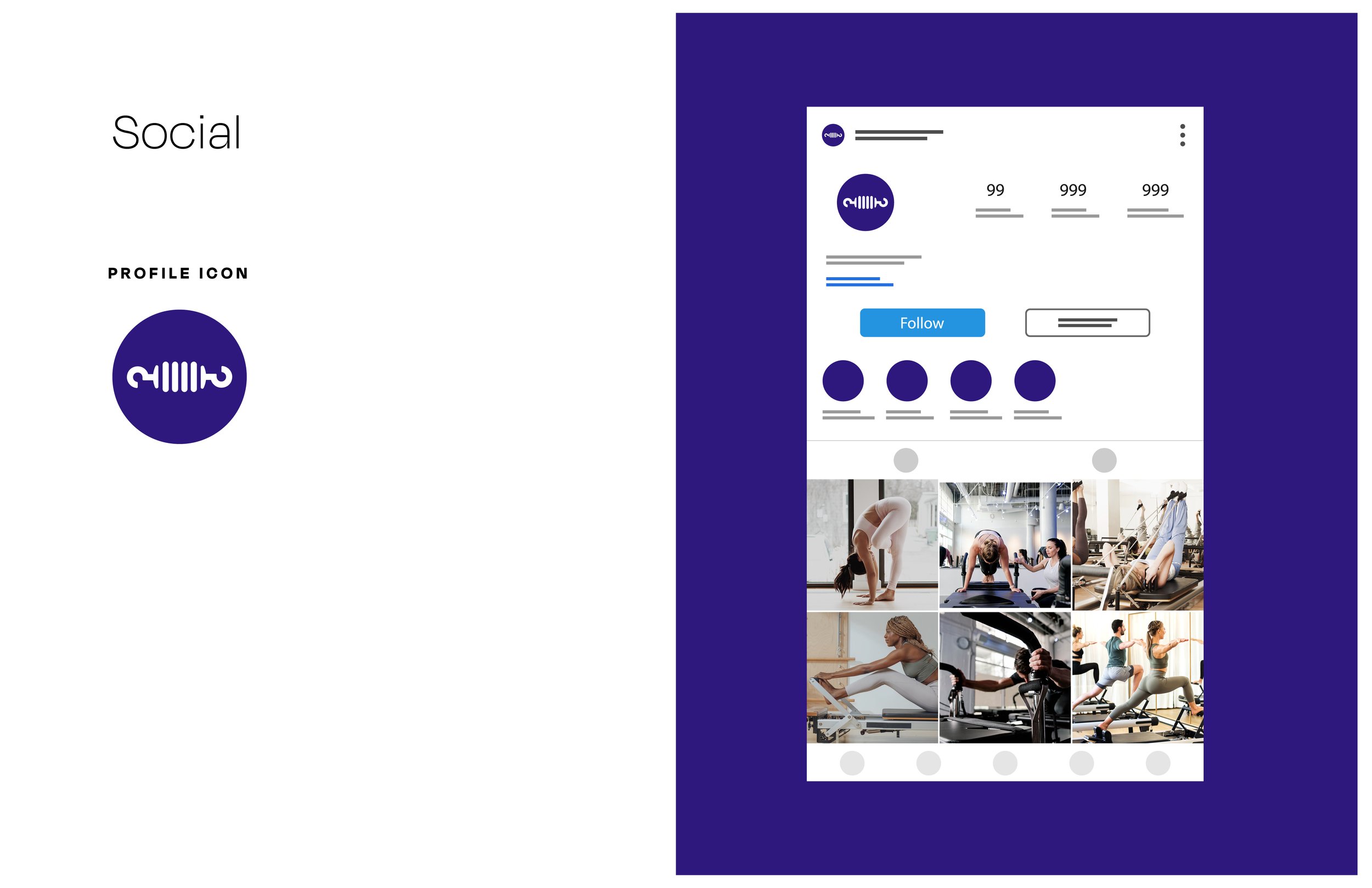
We kept the type friendly and welcoming with a modern san-serif and played to the audience’s location by paying homage to the city’s established University culture, LSU, using a vibrant purple that felt lively and gender neutral. The mark is a spring, an essential part of the X-former machine that provide resistance and builds endurance and strength.
Services
Brand strategy
Brand Identity and Logo System
Brand Guidelines